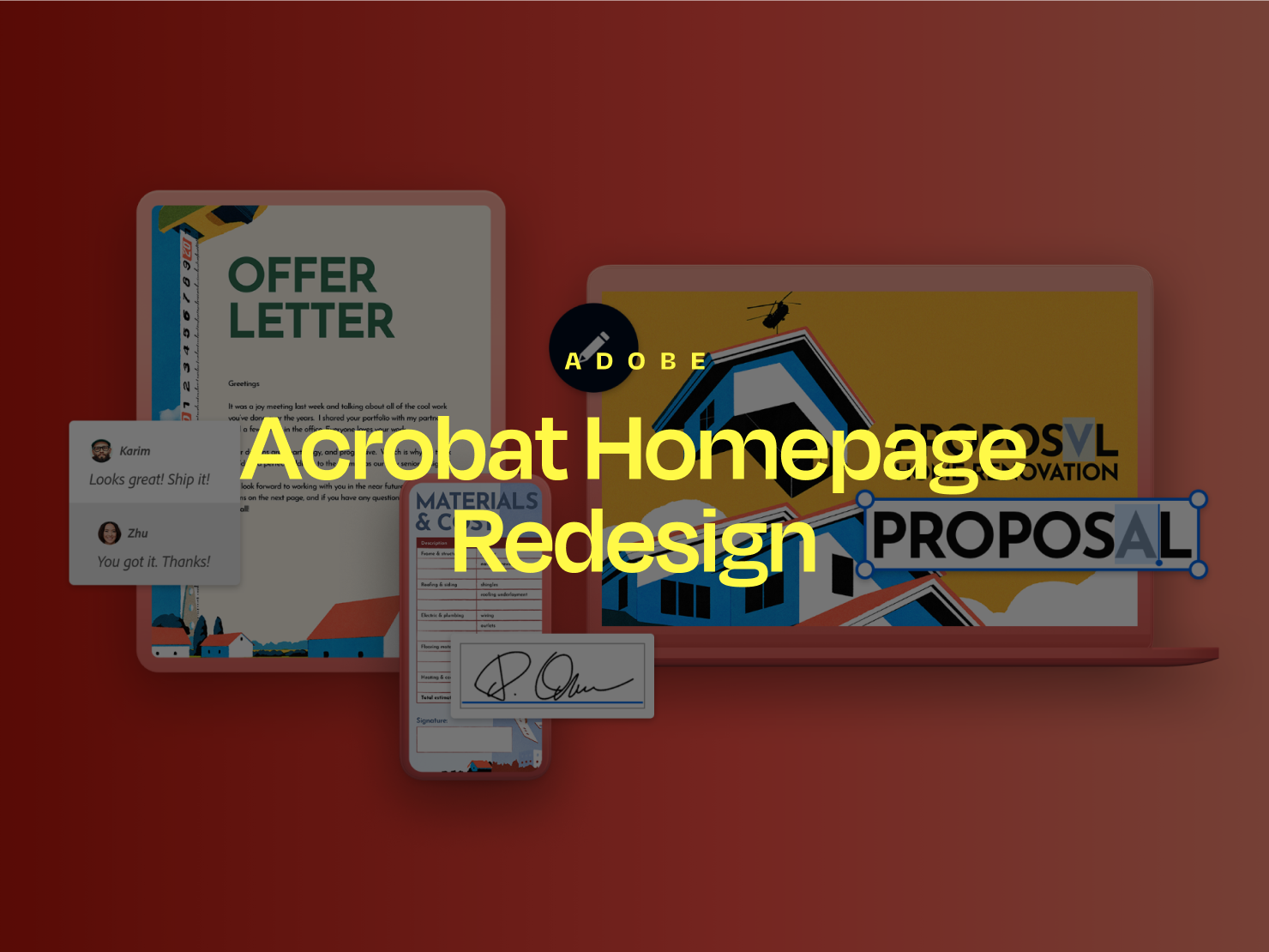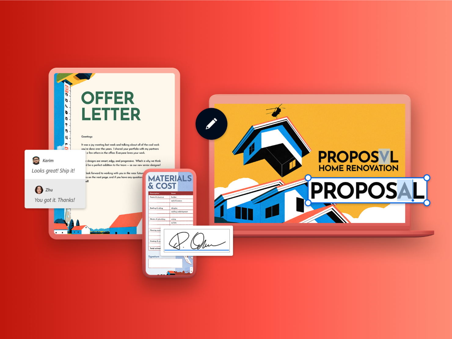
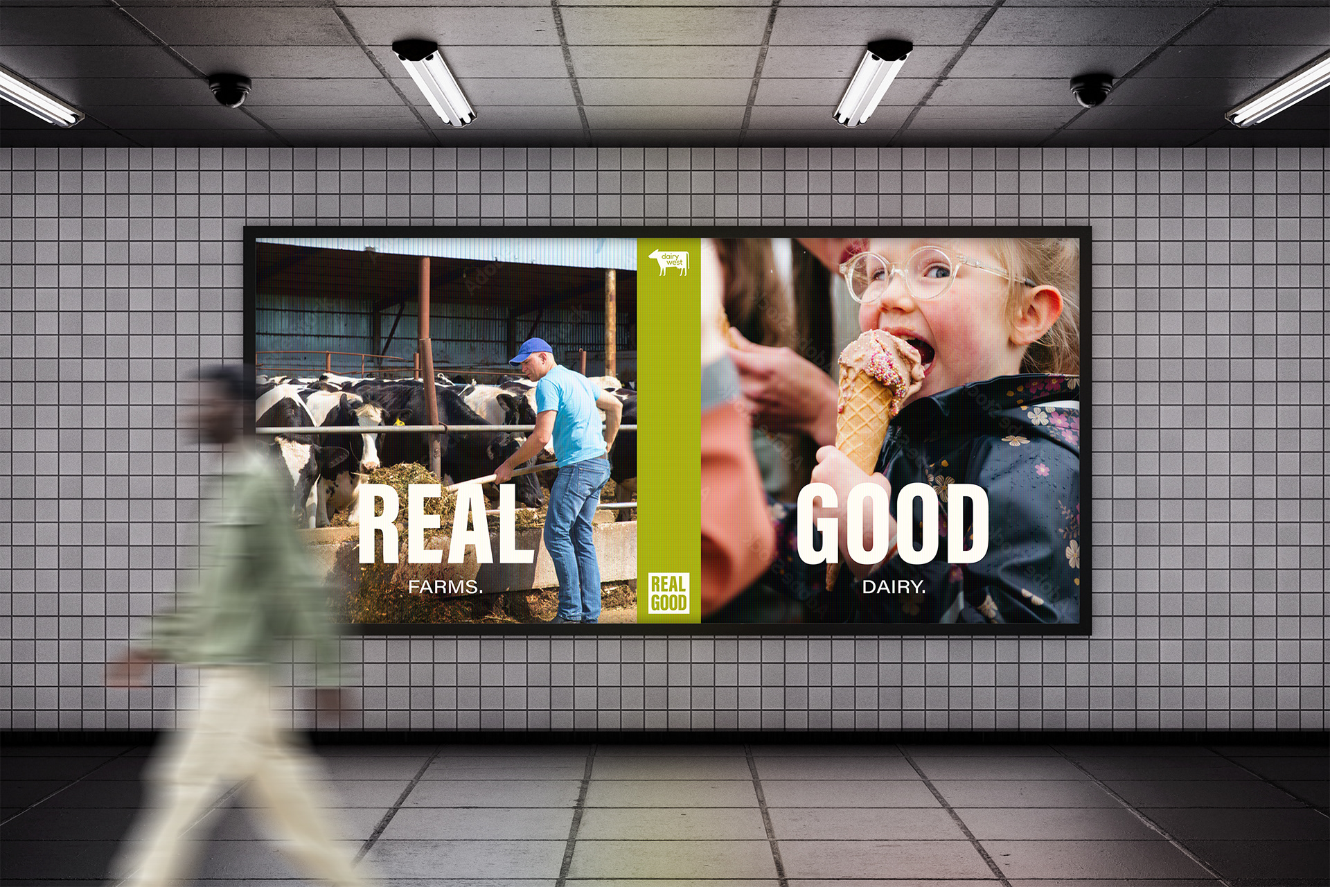
Campaign Visual Concept
This was a campaign visual proposal for a dairy co-op that promotes local dairy. The client ended up moving in a different direction.
I created the lockup, or stamp, for the tagline “Real. Good.” I wanted a quick lockup that could be placed on every iteration for quick recognition. Bold but still legible at small sizes. I picked the typeface Acumin Extra Condensed because the letters are balanced horizontally, so when “Real Good” is stacked, they are the same length for a nice square stamp.
I mocked up billboards, adlobs, and a website marquee. The visuals could be the 50/50 layout as well as single-image versions. One element I added that I really love is the cream color for typography; it brings more warmth than stark white.
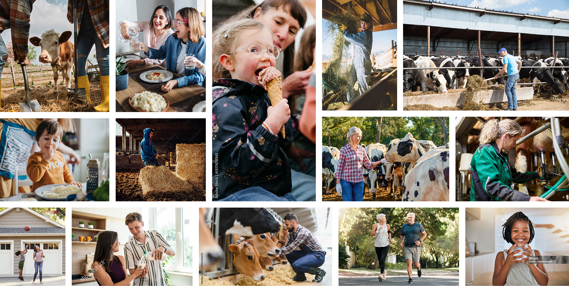
The photography direction was docu-style, so I compiled a library of photos from stock that look natural, genuine, authentic, and caught in the moment. Real farmers and real people.

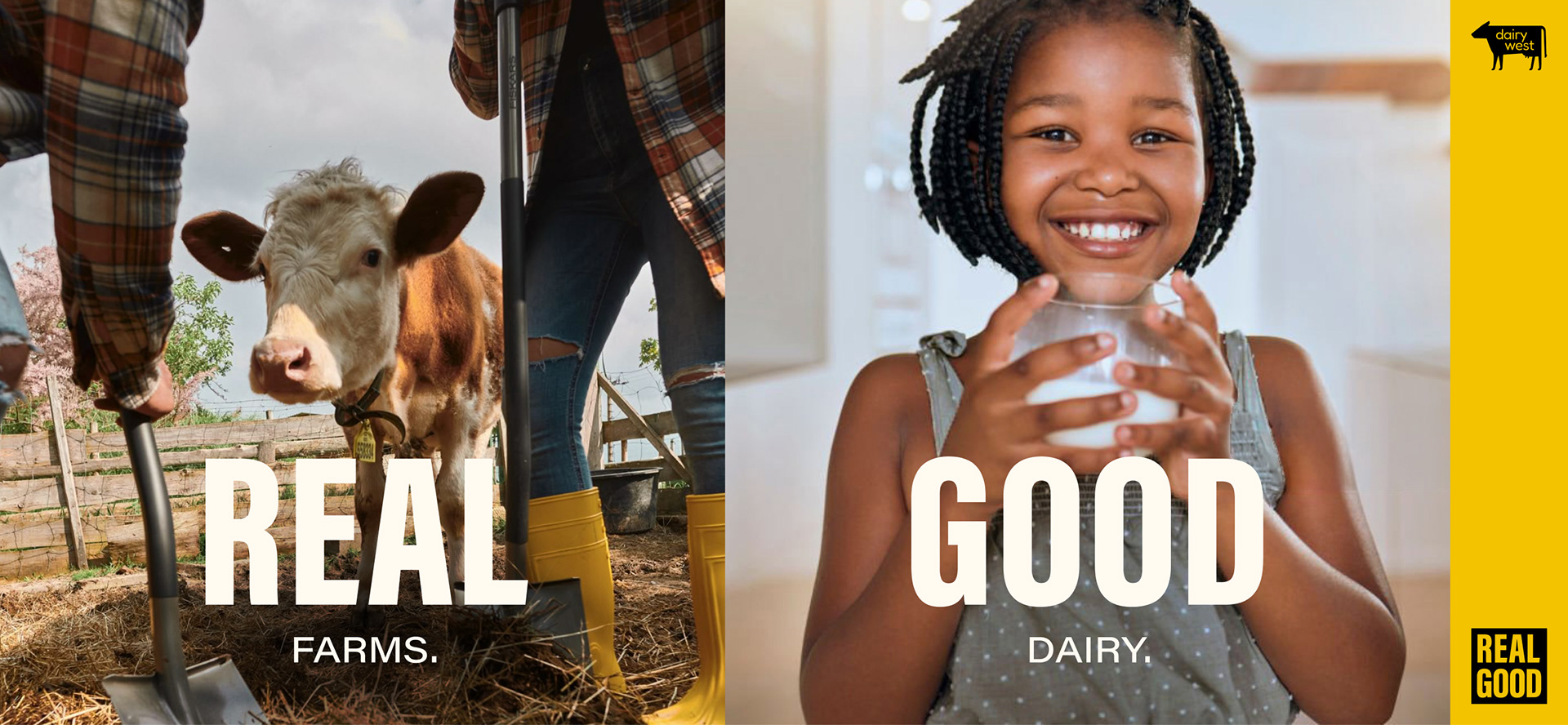
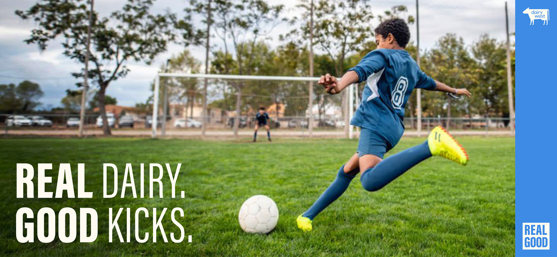
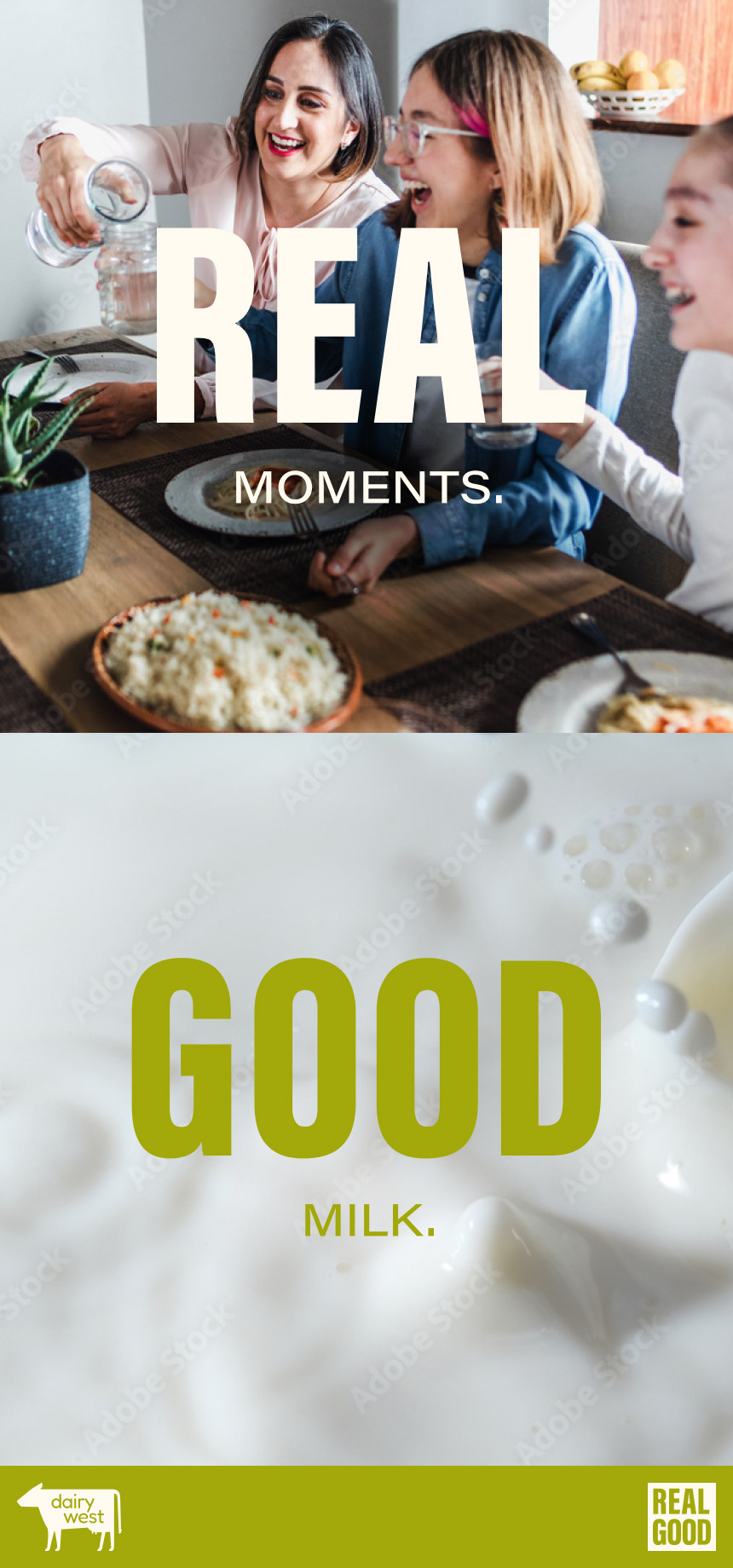
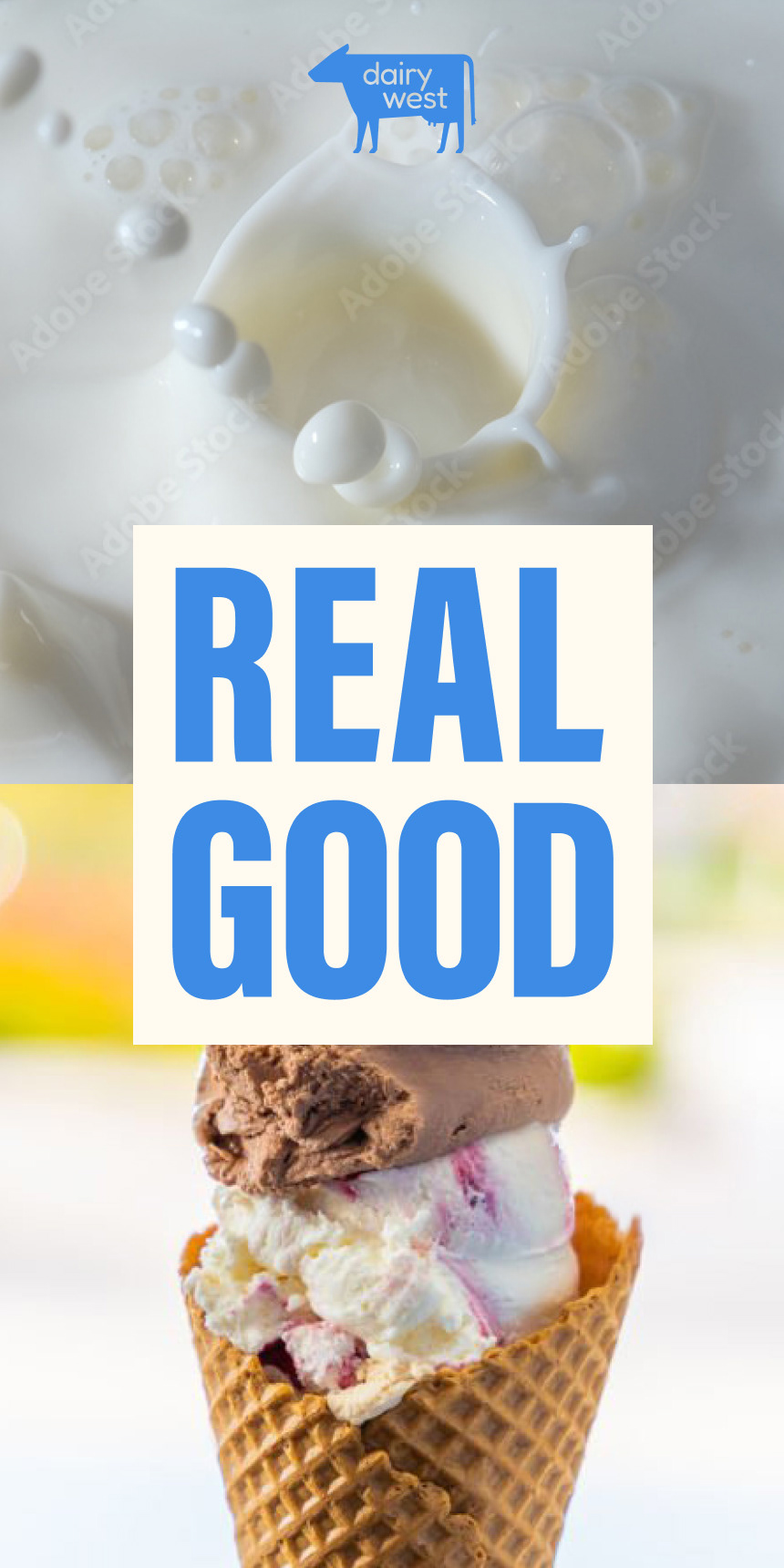
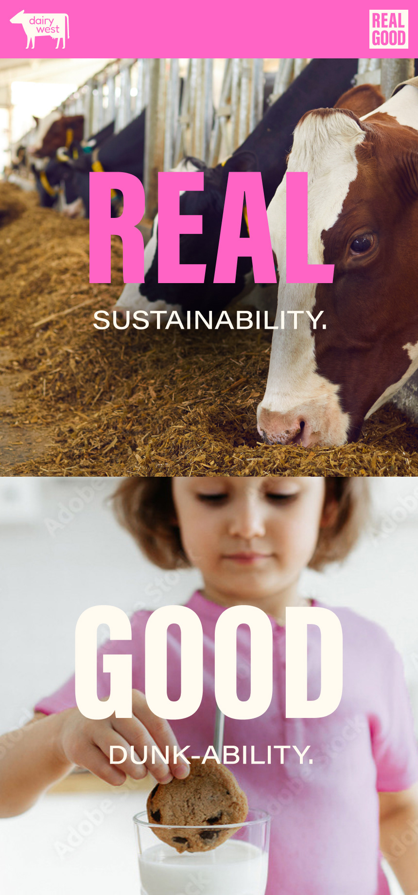
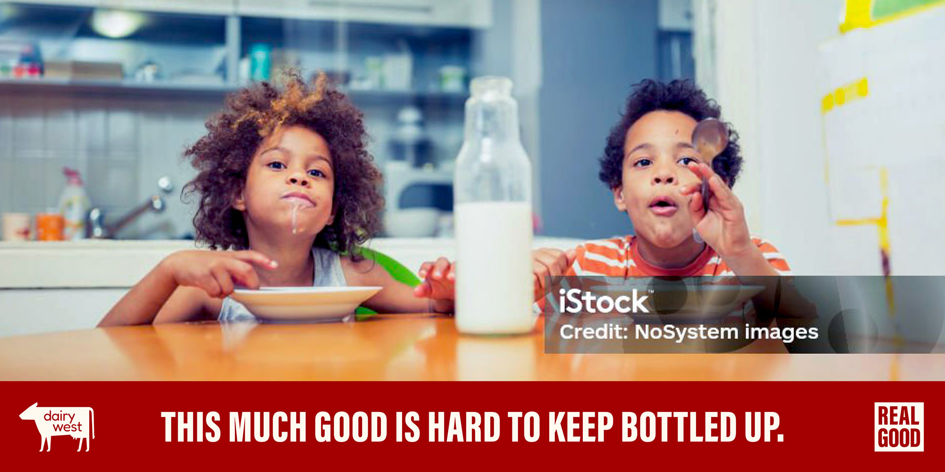
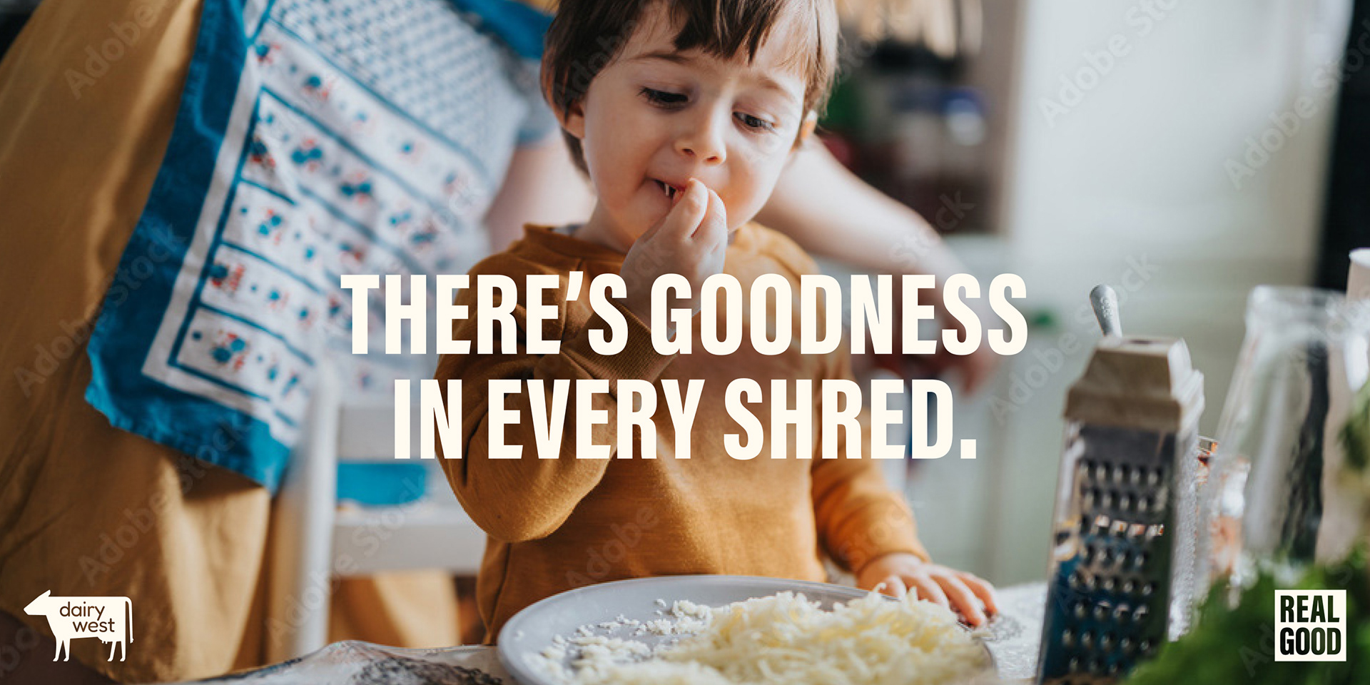
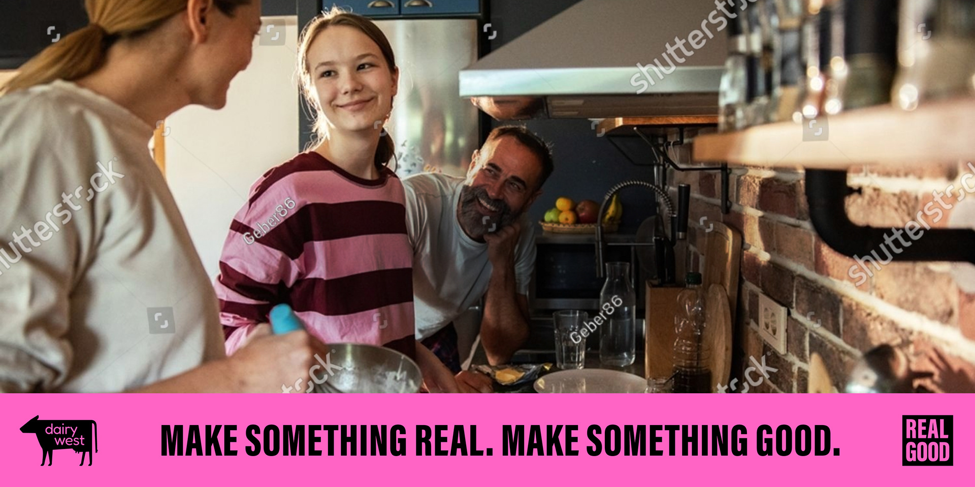
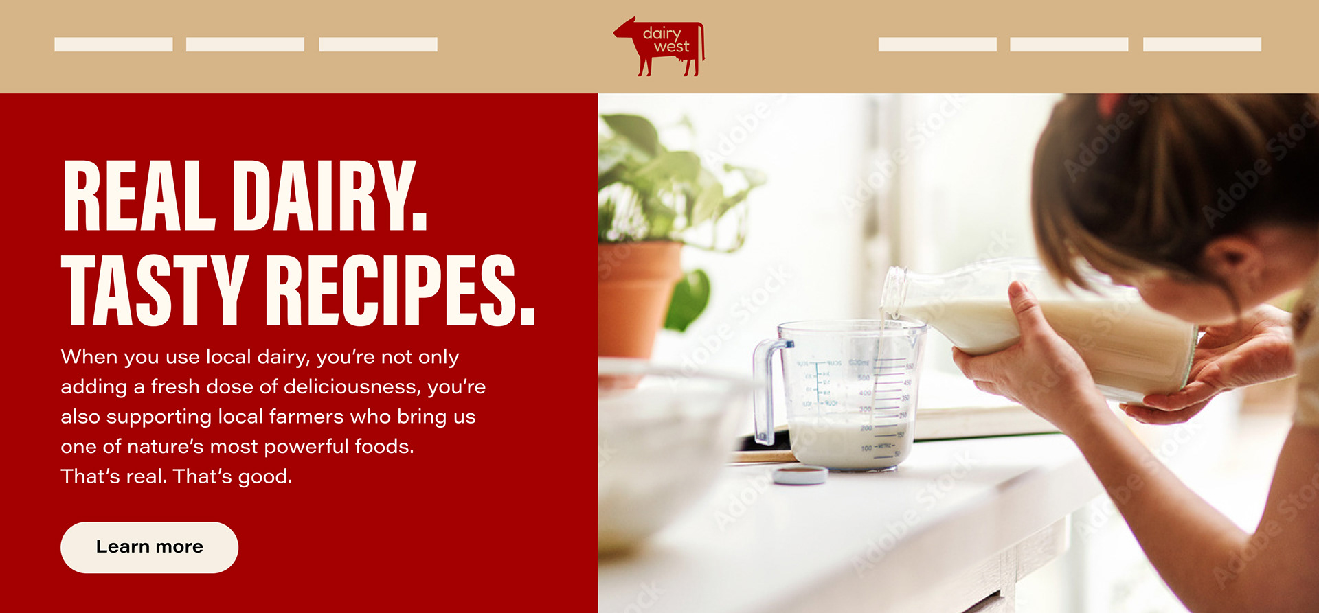
Photo style